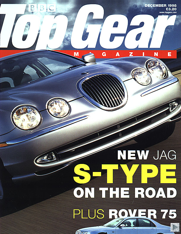
Colour- In Vogue there are only three main colours. This house-style is used for many magazines. Here they have used white, black and blue. On the Top Gear magazine cover they have used more of a variety of colours but the house-style is still quite plain and easy to see what is going on. They have used basic colours, White (being the main colour of the text), red and yellow.
Design- he text Vogue have used is very pain and simple. They haven't used any different fonts, it is all easy to read, stands out and is clear to see what is being said. On the front page of Top Gear the Design is quite similar, it is the title which is obviously the peice of writing which stands out most. There is a peice of text in the bottom right hand corner, which is written in different sizes to make the mains words stand out the most, but other than this there is no other writing, the main feature is the car. Just the same as in Vogue the main feature is Beyonce.
Image- Vogue have obviously used Beyonce as their main focus on the front of the magazine because she is a huge popstar and is someone who is always in the limelight who many girls aspire to be like. The Top Gear front cover have also only one picture, and in this case is the picture of the Jaguar. This car has been put on the front cover because it was a new car out that month when that issue of the magazine was published. And it's also a car which many working class men would love to have.
Pose, style, hair, make-up-
On the front cover of Vogue they have styled Beyonce in a very sophisticated way. What she is dressed in, the way she has her hair and the way her make-up has been done is all very professional and she looks very working class. This would encourage people of her age to want to buy the magazine because people want to be just like her. On the Top Gear front cover they have no people so there is no style/make-up/hair to be styled. But the style of the car is very sophisticated.
Composition and framing-
The composition of the Top Gear front cover and of Vogue are both quite similar, when yourst look at both of the pages you instantly look in the top right have corner of the page. This is the side where the Title and most of the pages writing has been placed. The background of the Vogue cover is not very clear, but it looks as though beyonce is standing up against a wall and you can vaguely see out of the window next to her. On the cover of Top Gear all you can see is that the car is driving down a road. This isnt very clear though, as the picture of the car is very big and is the main focus of the cover.
Written codes- how are words used on the cover?
On the cover of Top Gear you can see that the picture they have used suggests that inside it will be about cars and that on the front of Vogue by looking at both the picture and the text it will be about fashion and womens topics
e.g. losing weight and fashion for every firgure from 0 to 20.
Language-
The language that has been used on the front of Vogue are words which catch the readers attention and make the reader wan to buy the magazine. In this case, the words in bright blue stand out the most. They purposely pick out the main words and write short, sharp statements which are straight to the point. On the front of Top Gear there is alot less language but they have used very few words but the words they have used have been chosen carefully to get across what is it that they are promoting, the reason why and that it is a new car.
Overall impression- how effective is the front cover?
In my opinion, both front covers are very good. They both put across the point they are trying to give and are both very affective. You can clearly see straight away what it is that they are going to have in their magazine and know what youare expecting to be inside the magazine. The Beyonce one gives you a bit more of an idea as it give you short statements and sentences about a few articles that will be in the magazine. Whereas the Top Gear one doesnt tell you about any of the articles which will be inside it, although it is similar to most editions so you know to expect that inside there will be more articles about cars.
